Hello I'm Andi
I like to build highly performant websites which innovate with genuine value.
- I am interested in new speaking opportunities.
- I am interested in opportunities to write articles and blog posts.
- I am currently unavailable to collaborate on new projects.
Blog Posts
Here are some of my most recent blog posts:
The Start of Something New
Friday, January 12 2018
After almost 11 years, I am moving on from AKQA to pastures new.
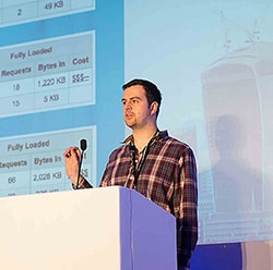
The Quest for the Perfect Workflow
Friday, May 16 2014
Today I spoke at jQuery UK on my Quest to find the Perfect Workflow. This post provides detailed information; slides and the links to the material mentioned in my talk. Now updated with screencast!
Creating a List of Posts in Assemble
Thursday, February 27 2014
In the previous post, I showed how to get started with Assemble. Now we have content, let's look at how we can create a list of posts.
Getting Started With Assemble
Wednesday, February 26 2014
Want to create a static site blog with Assemble? You've come to the right place. This in-depth tutorial will get you started with creating a blog in Assemble!